The rabbit hole
People love Wikipedia. People love Wikipedia for specific reasons. One of the popular ones, as explained by XKCD, is the author’s three-hour journey from the article on Tacoma Narrows Bridge to others like “Fatal Hilarity” or 24-hour analog dial.
We call this the “rabbit-hole” around the halls of the Wikimedia Foundation’s office. (Shameless plug for the Wikipedia Rabbit-hole t-shirt.)
This is one of the most iconic and popular user patterns we see on Wikipedia. People start on one article, and then head somewhere else, and then somewhere else, learning about lots of different topics along the way.
We design for these readers, optimizing not for page views or engagement — but for learning. And it turns out that context is a key part of learning.
Context matters, but context switching is costly
Page previews, as a feature, is a utilitarian interaction pattern that has been around since the invention of JavaScript.

Here’s how Twitter, for example, uses previews to get context about a user. Screenshot/GIF via Twitter, fair use.
It is not a groundbreaking solution for providing context without losing the thread. Yet, even the most basic interaction changes on Wikipedia come with their own unique challenges. Let’s shed some light on why this is a big deal:
A few numbers to grok at
- Nearly ~28 percent of Wikipedia’s traffic comes from clicking on internal blue links. a.k.a going down the rabbit hole
- Blue links account for ~230 million page views per month
- ~2 million links get hovered per minute across all Wikipedias
In other words, blue links are the most frequently-used interactive elements on Wikipedia. This makes messing with or changing any feature related to blue links a bit more… delicate and challenging.
Add value not pain
Modifying such frequent behavior is difficult. We began by using qualitative and quantitative insights to conclude the interaction timeline for showing a preview:

Timeline shows events after a user hovers on a blue link. Graphic by Nirzar Pangarkar/Wikimedia Foundation, CC BY-SA 3.0.
Given Wikipedia’s scale, a minor change in any of these variables could always result in a massive impact on the experiences of the end user as well as on our infrastructure. Using evaluative research, we learned that some people read text online by hovering over sentences making page previews potentially annoying for this audience.
Building in artificial delays before the page preview appears — about 650 milliseconds — allowed us to reduce the number of unwanted previews. We also made it simple to disable this feature without having to jump through hoops.
Representing the context
The next challenge was to represent an article with information that is available and information that is not available. How do you account for unknown content? Well, you design for all the possibilities.
Edge cases, edge cases, and edge cases
I don’t like the term, personally. Mostly because it gets misused to make design decisions. It is even more inaccurate when it comes to designing for Wikipedia.
Wikipedia’s content is written by more than 500,000 humans and bots across 300 languages. It differs in tone, format, availability, level of detail, and subject matter. Everything is an edge case, hence nothing is.
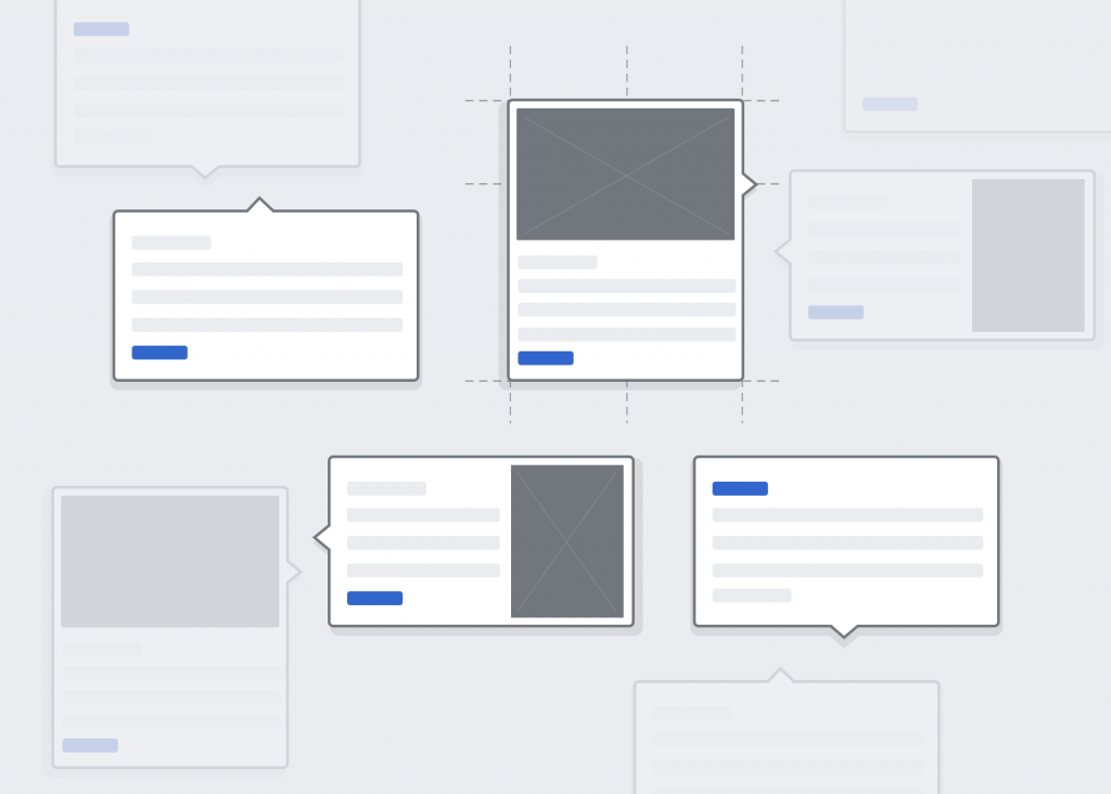
Designing the preview was like playing Tetris without knowing what the next piece is going to be. Here are different variations of previews laid out:
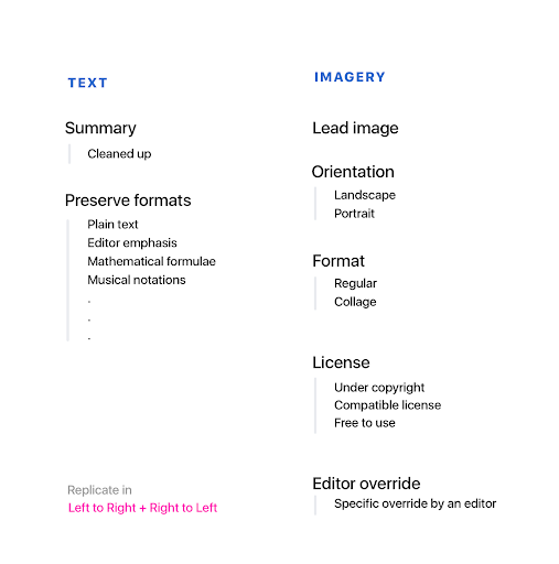
Graphic by Nirzar Pangarkar/Wikimedia Foundation, CC BY-SA 3.0.
This diverse set of use-cases results in different representations of an article ranging from landscape images, tall portrait previews, right to left previews for links that lead to list of articles. Adjusting line-height for math-related pages on Tamil page previews so the sentence clipping works properly is part of designing page previews.
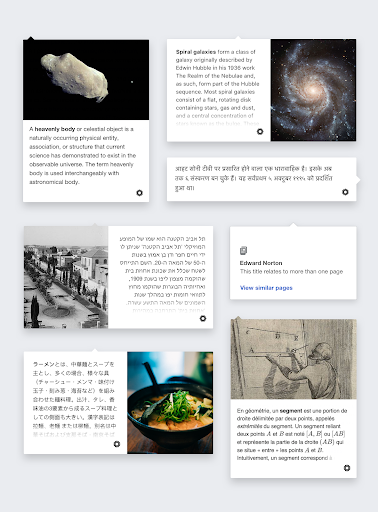
Graphic by Nirzar Pangarkar/Wikimedia Foundation, CC BY-SA 3.0. Text from the indicated Wikipedia articles in various languages, CC BY-SA 3.0. Enclosed images may be under different licenses.
Future of page previews
This is just a beginning — page previews open possibilities in multiple areas, as context is becoming more and more important not only on Wikipedia but on the internet in general. (Note that these are just ideas, and are not in active development.)
Support for more types of contents
Currently, previews are meant only for articles but we have built them in a way such that they could be used for different types of content and formats.

Graphic by Nirzar Pangarkar/Wikimedia Foundation, CC BY-SA 3.0.
Power previews for editors
As of now, page previews are designed for readers — but they could be adapted for power editors by hosting comprehensive information and useful actions that are more relevant to editors.

Graphic by Nirzar Pangarkar/Wikimedia Foundation, CC BY-SA 3.0. Text from Wikipedia’s article on the Mona Lisa, CC BY-SA 3.0. Enclosed image, public domain.
Wikipedia outside Wikipedia
We call on Wikipedia as second source material. Just like a dictionary is used to explain the meaning of a word while you are reading a book, Wikipedia is often used as a second source to know context for reading even outside of Wikipedia.
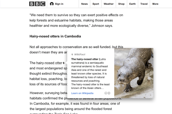
Graphic by Nirzar Pangarkar/Wikimedia Foundation, CC BY-SA 3.0. The preview includes Wikipedia text from hairy-nosed otter, and the underlying article is from Jeremy Coles, “Conservation success for otters on the brink,” BBC Earth, 20 June 2017, used here under fair use.
Wikipedia previews could be adopted by other publishers as a means to provide quick context around topics.
Wrapping it up
Page previews pave a path for another way to interact with Wikipedia. The reading experience of Wikipedia can be broken down into smaller pieces. We’re looking forward to more ways of moving away from the traditional notion of single monolithic articles towards more modular and contextual learning.
Feel free to provide feedback on our project page.
Thank you!
Nirzar Pangarkar, Design Manager, Audiences Design
Wikimedia Foundation
Want to learn more? See the original announcement and why it took us so long to build this.
This post originally appeared in “Down the rabbit hole,” our Medium publication. It has been modified for re-publication on the Wikimedia blog.
