At Wikimedia, we like to start our design process with understanding our audiences. Earlier in 2017, our New Readers initiative conducted ethnographic research in Nigeria and India. A few interesting tidbits strongly resonated with us on the Wikipedia Android team:
Mobile dominates for getting online, and Android is the platform of choice … Mobile apps have exploded in popularity, with instant messaging and social media at the top.[1]
Prompted by these findings, we’ve introduced a number of improvements to the Android app in order to better serve these app users who have restricted or low-bandwidth access to the internet.
Features for offline
During the past year, we’ve worked on a number of offline features throughout the app.
- Reading lists: Users can easily save articles to reading lists to view later when offline.
- Caching by default: All articles which have been opened are cached, and remain available even when the internet connection is lost.
- Offline Library: This feature envisions a seamless experience browsing Wikipedia from online to offline in one place. Users can download collections of Wikipedia articles to their ‘offline library’, and continue to search and read those articles with or without internet. An initial prototype was tested with users in India (see research findings) in September, and will be available in early 2018.
Designing for offline
We’ve tried to apply a number of best practices when designing for offline and low-bandwidth audiences on Android. We want to share the following key considerations as a handy guide for those of you who may be designing for similar audiences.
- State awareness
Knowing the state of a user’s internet connection and reflecting this in the product design is essential when those connections are unreliable.
We’ve introduced clearer in-product messaging throughout the app, so users are always aware of their connectivity status and know when they are reading offline content.

Examples of different notifications when the app is offline. Left: ‘Toast’ notification when an offline version of an article is shown. Center: Message shown in the Offline Library when searching whilst offline. Right: Message to refresh when.
- Contextual actions
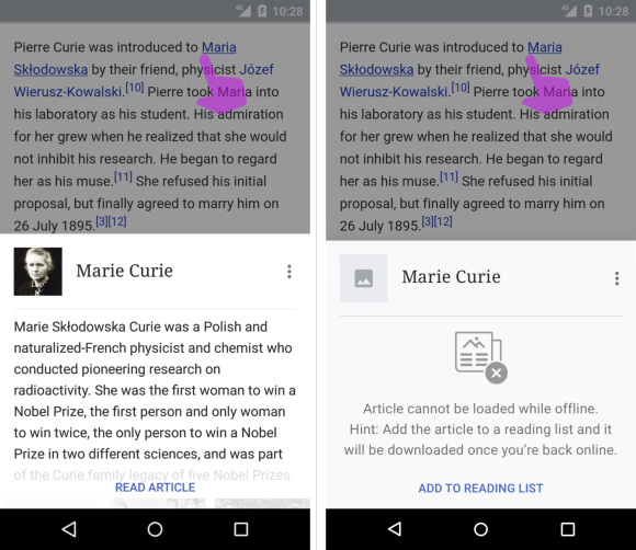
Related to giving clear indication of the connection status to users, we are also providing more contextually relevant actions that appear when the app is offline. An example of this is when a user taps on a link whilst reading an article. When that user is online, a preview of the linked article is displayed, but when they are offline, rather than showing a ‘no connection’ message, they are provided with the option to save the article for reading later once their connection is restored.

Difference in a link preview card when a user is online vs offline
- Feedback on slower connections
For those on slower bandwidth speeds, it’s particularly important to be assured that actions taken have been recognized and something is loading. Lack of feedback may lead to unnecessary time and/or data wasted in as a process is re-triggered, or worse yet people may abandon whatever they were trying to do if they feel the app is unresponsive on slow connections.
Bearing this in mind, we’ve added more progress indicators to provide this feedback to users when an article is being saved to their reading list, and users are also clearly shown the progress of article packs being downloaded to their Offline Library.

Left: Progress indicator that an article will be saved to a reading list once a user is back online. Right: Message showing the progress of an article collection being downloaded into an offline library.
We’re also planning to revamp the loading screen to show a ‘skeleton’ version of the app, so that users may better anticipate what content is being gathered from the moment they open the app, and provides a greater sense of progress than the current static screen showing a ‘W’ Wikipedia icon.
^ Left: Current static loading screen. Right: Upcoming ‘skeleton’ loading screen
- Smarter caching for unreliable connections
Rather than putting the onus on users with flaky connections to explicitly save every article they have open for offline, we changed the system behavior to cache articles as soon as they are opened. This way, all articles people have open (and even articles in their recent history) remain browseable even when they lose their connection midway through reading.
- Data usage controls
More settings are now available for those who wish to save on data usage, such as an option to disable images, and another option to ‘prefer offline content’ instead of always loading the latest version of an article.

Left: Show images setting. Right: Prefer offline content setting.
In future, even more controls are planned, including:
- An option to download articles on WiFi only: T163596
- An explicit offline mode: T164756
- Loading lower resolution images for thumbnails prior to loading full resolution images: T159712
- Data usage and storage
By being more transparent about how much storage space is used by offline articles, we hope it helps people with limited and expensive data packages to have more visibility of their data usage and make decisions accordingly.

Left: Article collections for download clearly shown with filesize. Center: Total storage space used by the Offline Library. Right: Reading lists show the number of articles available offline and the list file size.
We’re also investigating ways to reduce the size of the app itself by reviewing alternatives to data-heavy features like using Mapbox to view articles nearby in a map view.
- User education
Part of creating a better offline/low-bandwidth experience requires making people aware of those benefits with clear messaging, so that they know how and where to access to content in preparation of being offline.
With that in mind, we’ve introduced user education onboarding guides and also taking advantage of ‘empty states’ to provide more information about features as users interact with the app.

User education screens for the Offline Library feature

Empty state screens
- Sharing offline
Another key finding from the research was that “People are increasingly getting information online, then consuming or sharing it offline”.[2]
The offline library feature was designed with this in mind, with users who download article collections on one device able to copy and share the same files with others via USB, transferring to microSD card, or even via a Bluetooth connection. The app can detect multiple article collection files whether they are installed on a device or anywhere in an external SD card.
Finally, besides the ‘Offline library’ feature, the Wikipedia app itself may also be sideloaded, available on F-Droid (outside of the Google Play store), or else the APK for the current and previous versions are available to download and share from our Wikimedia Android releases page.
- Battery saving considerations
Users in low-bandwidth areas tend to have devices with lower battery capacity and have less opportunities to recharge during the day,[3] so we’re also starting to consider ways our app can reduce battery consumption.
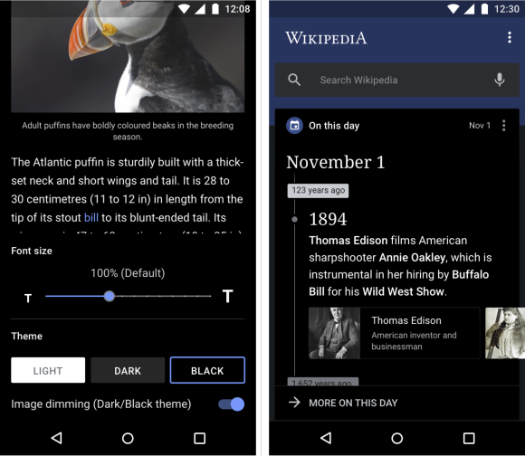
A recent update made to the app with battery saving in mind is the addition of a ‘Black’ mode, since it has been shown that AMOLED devices derive substantial power savings when using a mostly black colored UI as compared to colour/light mode version of an app.[4] It’s a notable example of the impact of design decisions in this space as well as the more ‘expected’ development decisions (batching network calls, reducing app wake time, etc).
And as a final example of all the changes to the app, it’s also humbling to note that this feature was initially brought to our attention via feedback from our users.

Examples of Black mode
Your input
As the Android team strives to keep improving our app, we always welcome input and feedback from our users, and can be contacted via IRC (#wikimedia-mobile) or by emailing mobile-android-wikipedia@wikimedia.org. And as an open source project, we also welcome contributions! For developers who wish to get involved, more information on getting started is on our App hacking page.
Further reading
The Wikimedia Foundation’s Design team as a whole is continually striving to improve our products for offline and accessibility, which is one of the reasons for our iOS app being named as an Editor’s Choice). This is in line with efforts from multiple organizations seeking to better cater for a large number of people worldwide with technical barriers to knowledge. Below are some links to our internal research and well as other interesting resources we’ve come across in this space.
- The Wikimedia Foundation’s New Readers program
- Mozilla and Digital Divide Data’s Digital Skills Observatory study
- Google’s collection of articles in their Design Library and Developer site as part of their Next Billion Users
- Nielsen Norman article on Mobile User Behavior in India
Rita Ho, Senior User Experience Designer, Audiences Design
Wikimedia Foundation
Screenshots of the Wikipedia app above include Creative Commons-licensed content from the Wikipedia articles “Puffin,” “Atlantic Puffin,” “Marie Curie” (both CC BY-SA 3.0), and the Wikimedia Commons images Puffin002.jpg (CC BY-SA 3.0) and Atlantic Puffin Fratercula arctica.jpg (CC BY-SA 2.5).
Footnotes
- ‘New Readers research findings presentation Sep 2016’, 2016, p36, 51.
- ‘New Readers research findings presentation Sep 2016’, 2016, p58.
- ‘Building for billions’, Accessed Dec 5. 2017.
- Triggs, R., ‘Do black interfaces really save power on AMOLED displays?’, Oct 22, 2014. Accessed Dec 5. 2017.


